2018 AP Art Show Reflection
- What stood out most about this work when you first saw it?
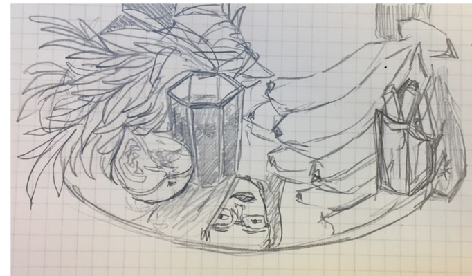
The vibrant colors stood out the most when I looked at this artwork. Also using colors that we don't usually see in that object, such as using blue to outline the banana, was very impressive. Also I've realized that there are grass on the plate, which isn't typically seen with fruits on a plate.
What stands out to you now after you’ve examined the work in detail?
I think it's interesting that the painting has the reflection of the food on the plate instead of just shadows of the foods. I think this makes the artwork unique from other paintings of fruits which can be easily seen from other artists. Also, I've realized that the objects on the plate are somewhat interesting because they have both healthy fruits and fast foods (french fries and coke). - What do you think the work is about? Why do you think that?
I think this work is about the struggles of having a healthy diet because the plate has both healthy foods (bananas and melon) and fast foods (french fries and coke). Also, the smile of her face reflected on the plate seemed to show the excitement of eating the food, which might mean that she is happy when she eats both healthy and fast foods, instead of only eating healthy foods. - What is a design principle or element that the artist is using in this work? How is it being used?
I think this artist used contrast effectively because she used dark navy blue for the background contrasting to the vibrant colors on the plate. Also, the idea of putting foods with contrasting healthiness can also be an example of a contrast she used in this artwork. - What is one question you have if you could ask the artist?
I want to ask he how she was able to find and use colors that cannot be seen on the object with a naked eye yet paint it so naturally. Moreover, I want to ask her how long this painting took for her to finish.
2018 Spring Art Show Reflection
Title: With my Best Friend
Artist (Grade): Jihyun Woo (4)
Artist (Grade): Jihyun Woo (4)
- Why are you interested in this piece?
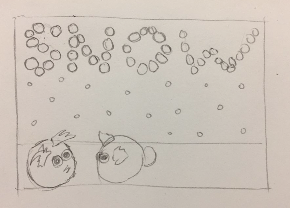
- This artwork stood out to me because out of all the other artworks done by elementary students, this was the only artwork that incorporate 3D elements into the 2D artwork. Moreover, it was interesting how the poms were put into paper so that it is written as 'snow'.
- What do you think the artist’s goals were?
- I think the artists' goal was to portray the warm feeling winter can have. Also, considering the title, I think the author depicted himself as a rabbit and drew another rabbit to be her friend.
- What design/technique is most effective? Why?
- I think the use of poms were most effective because it makes the artwork much more eye-catching and more unique than other artworks about winter that simply color/draw the snows. The poms give an warm and fuzzy texture to the artwork while it's whiteness also blends in perfectly with the winter theme.
- Did your understanding of the work change after reading the artist statement.
- After reading the artist statement, I realized that the animal in the artwork is not a rabbit but a hamster, which is also her favorite animal. Moreover, it was interesting to find out that the artwork is showcasing transformation because the snow is turning into hamsters.
- Did the artist do a good job writing the artist statement?
- Yes because she was very clear about the thought process she went through when she was brainstorming for her artwork and what adjustments she had to make in order to develop her artwork.
- What do you still want to know about? What is unclear?
- I would like to know why she chose poms instead of other art materials and what inspired her to think of the idea of snow changing into hamsters.
Title: The moment of choice
Artist (Grade): Cathy Kim (12)
Artist (Grade): Cathy Kim (12)
- Why are you interested in this piece?
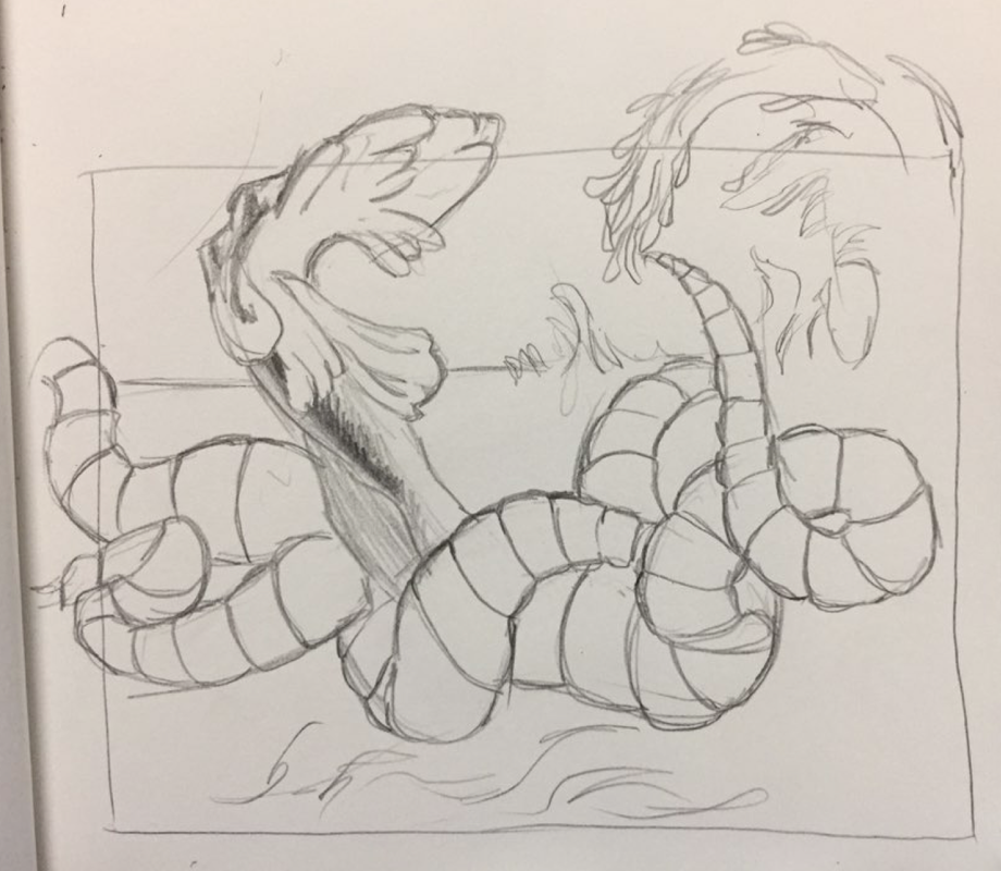
- The somewhat abstract yet high quality details on the waves and the vibrant colors of the octopus caught my eye, and I wanted to read the artist statement because I wasn't quite sure how the body of the octopus worked out.
- What do you think the artist’s goals were?
- I think the artists' goal was to depict a dynamic scene in the ocean with an octopus fighting against the tide. Moreover, I think the statue, created by human's greed, is an artifact harming the environment of sea animals.
- What design/technique is most effective? Why?
- The use of colors are very effective because the author used very vivid colors for the octopus, yet make the artwork look balanced by using tone downed blue and brown for the ocean and the statue. Moreover, the colors and shapes are very fantasy-like yet gives an realistic feeling due to the details of the tides and the testicles.
- Did your understanding of the work change after reading the artist statement.
- It changed a lot because I found out that the statue was actually the octopus's head and it represents the conflict the good and evil of decision making. Moreover, the octopus works not only as the functional part that holds the brain, but also as a part that holds it life.
- Did the artist do a good job writing the artist statement?
- The artist was able to start the artist statement very interesting that it kept me engaged. Moreover, the artist asked questions to the audience, which helped me think more personally and deeply about the artwork.
- What do you still want to know about? What is unclear?
- I am not sure how the statue being the head is related to the good and evil of making decisions. I think it would have been more relatable or understanding if she elaborated more on her interesting philosophies behind the artwork.

Title: Yi Sun Shin
Artist (Grade): Hannah Kim (11)
Artist (Grade): Hannah Kim (11)
- Why are you interested in this piece?
- This was not only the first artwork I saw as I was entering the art show, but it was also eye-catching because the author used an famous historical figure in her artwork. Moreover, the spaces she carved out created an interesting negative space and I thought this was an effective way to portray a face without simply tracing the eyes, nose, and mouth.
- What do you think the artist’s goals were?
- I think the artists' goal was to recognize Yi Sun Shin's achievements by making an artwork with his portrait. Moreover, I think the author used this artwork to showcase her skills in carving with great detail.
- What design/technique is most effective? Why?
- The carvings of Yi Sun Shin's face is very effective because it is pretty clear who the person is. Also, it's astonishing how she didn't make any mistakes while carving out with such meticulous details and preciseness.
- Did your understanding of the work change after reading the artist statement.
- The understanding of the work did not change but it was rather an addition to my previous thought. It was interesting how she thought of putting in the candles inside the box to make the lines shine through- that could've been also interesting.
- Did the artist do a good job writing the artist statement?
- I think the author could've stated stated briefly about Yi Sun Shin's achievements since some foreigners may not know about him. I think the author clearly stated the process and the skills she used to complete this project, which helped me as another artist who needs inspiration.
- What do you still want to know about? What is unclear?
- I would like to know why or why not she is planning to put her candles inside the artwork. Also, I would like to know if there was any specific artwork or artist that inspired her to create this project.
Where I live.
Name. Transportation Vehicle
I considered this place home because I feel most comfortable when I am in a transportation vehicle, whether it is the car, the bus, or the subway. I think this place is unique not only because it's a connection from one place to another, but also because I feel like I am able to see the most diverse people in this place. There is limited people I see in school and activities, and I will always see the people who I am familiar with. The idea of feeling most comfortable in a place with complete strangers was very interesting. Moreover, this place is unique to me because I feel very happy when I listen to music with earphones and it also seems like this is the place where I choreograph the best.
I considered this place home because I feel most comfortable when I am in a transportation vehicle, whether it is the car, the bus, or the subway. I think this place is unique not only because it's a connection from one place to another, but also because I feel like I am able to see the most diverse people in this place. There is limited people I see in school and activities, and I will always see the people who I am familiar with. The idea of feeling most comfortable in a place with complete strangers was very interesting. Moreover, this place is unique to me because I feel very happy when I listen to music with earphones and it also seems like this is the place where I choreograph the best.
2017 KIS Fall Art Show : Chroma
In our school, there is an art show every semester, and 'chroma' was the theme for this art show. This art show gives us a chance to not only present our work but also learn how the audience might interpret our artwork. In the past years, I was part of setting up for the art show and every year they organize or arrange the artworks in a different manner. This year, it was interesting to see 3D artworks that were mixed with 2D and digital photography, while artworks were still divided among age groups.
|
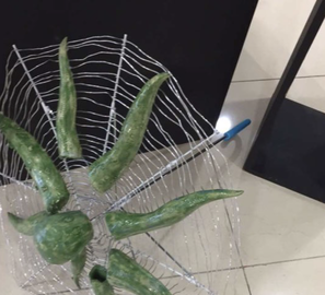
This is my 3D art project (description in the 'projects' and 'in progress' page) that I made in 3D Art III class for the past semester. This project was particularly meaningful to me not only because it had a personal reflection of who I am, but also because I was able to try out materials I've never used before (wires) and experiment with new methods to create effects on clay. Although it took me a long time, I learnt a lot throughout this project so I was very proud to present my artworks to my peers and my teachers. I believe it would have been more effective if the artwork was placed near a window so that a shadow can cast by the lines of the wires, but because of the art show room structure and direction of light, this wasn't possible.
|
|
|
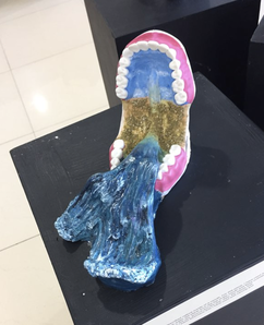
This artwork is called, "Waterfall" by Tommy Kim and although I do not have any connection with this artist at all, I found his artwork very interesting. I've seen one or two projects with teeth before but I felt that the idea of water rushing inside the mouth was very creative. Moreover, the color choice was very impressive, and made the project far more realistic and effective. After looking at this artwork for a while, I've realized how much effort he put in not only in the water textures but in shaping very curves and details of the teeth.
|
|
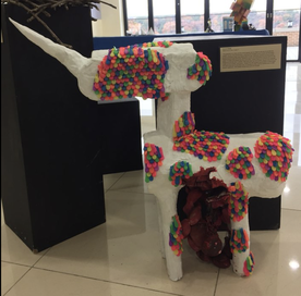
This artwork is called, "Unicorn Pinata" by Stella Park. This project was eye-catching not only because of its size but also because of its vivid bright color made with a very unique material- balloons. Although the colorful balloons were eye-catching, the author was able to balance out the focus so that the balloons were not dominating the attention from the main form, which is a unicorn. I think the use of materials and color matched very well with the general mood and atmosphere of the artwork.
|
|
|
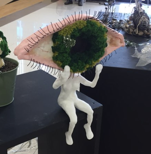
This artwork is called "I See You" by Skyler Kim. It was interesting to see how she made an eye, a concept that may be turn her artwork clique, to something personally meaningful and unique. I think it's very interesting when person's insight and philosophies are reflected on the artwork, which is she successfully did as an artist. Moreover, I was captured by not only the unique form but also the various materials she used to create her artwork. I can tell that she challenged herself to use various materials to express different parts of the eyes with precise details, by using wires for eyelashes and tree bushes for the pupils.
|
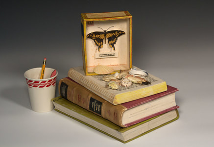
Artist Research- Richard Shaw
Nationality : American
Years Living : 1941~now
Known for his trompe l'oeil style of work, also known as optimal illusion. Trompe l'oeil style is a technique when artists use realistic 2D works to make something look 3D. Commonly repeated themes are portrayals of people by arranging materials uniquely, and presenting of butterfly with a book. Moreover, he uses objects that we use commonly, such as bottles, books, and tin cans.
|
|
|
“Richard Shaw.” 12 Artworks, Bio & Shows on Artsy, www.artsy.net/artist/richard-shaw/works.
- I chose this artist because I thought I would be able to learn the most from this artist than anyone else, since he uses objects that are easily obtained and seen. It was interesting to see how he rearranges these commonly used objects, so common that we don't even notice it, to create a completely different feeling. One similarity that this artist and I have is that we both don't try to make something look good or pretty, but try to emphasize the feeling the artwork gives. Although this is not my first time seeing artists incorporating objects into their artwork, his artworks were particularly unique in that he did not change the form or shape of the original object and yet still makes the common object give an unusual mood. I also want to try using everyday objects into my new project, to portray a whole new form or challenge myself to make a familiar object give a unfamiliar feeling.
